How do you make a large council’s visual identity simple, consistent, and accessible for everyone?
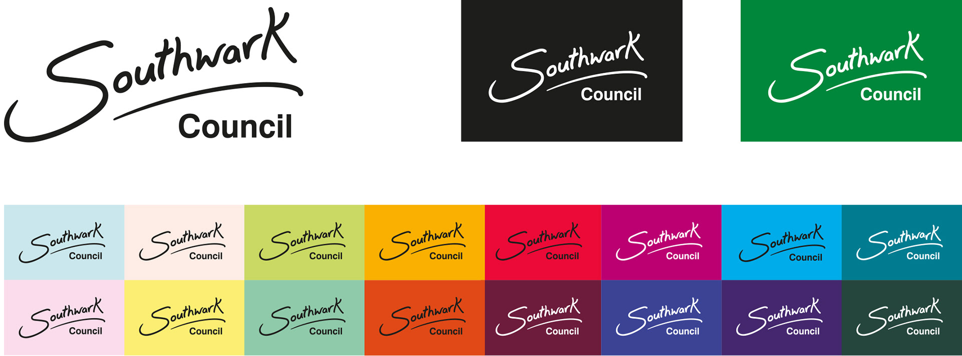
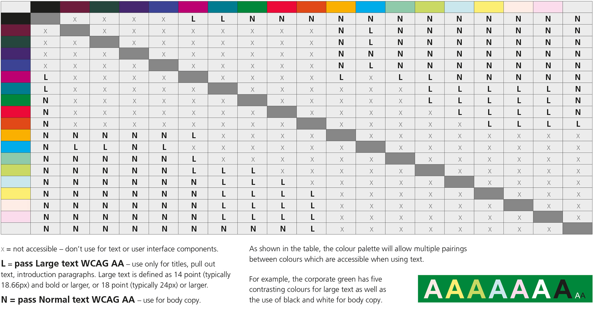
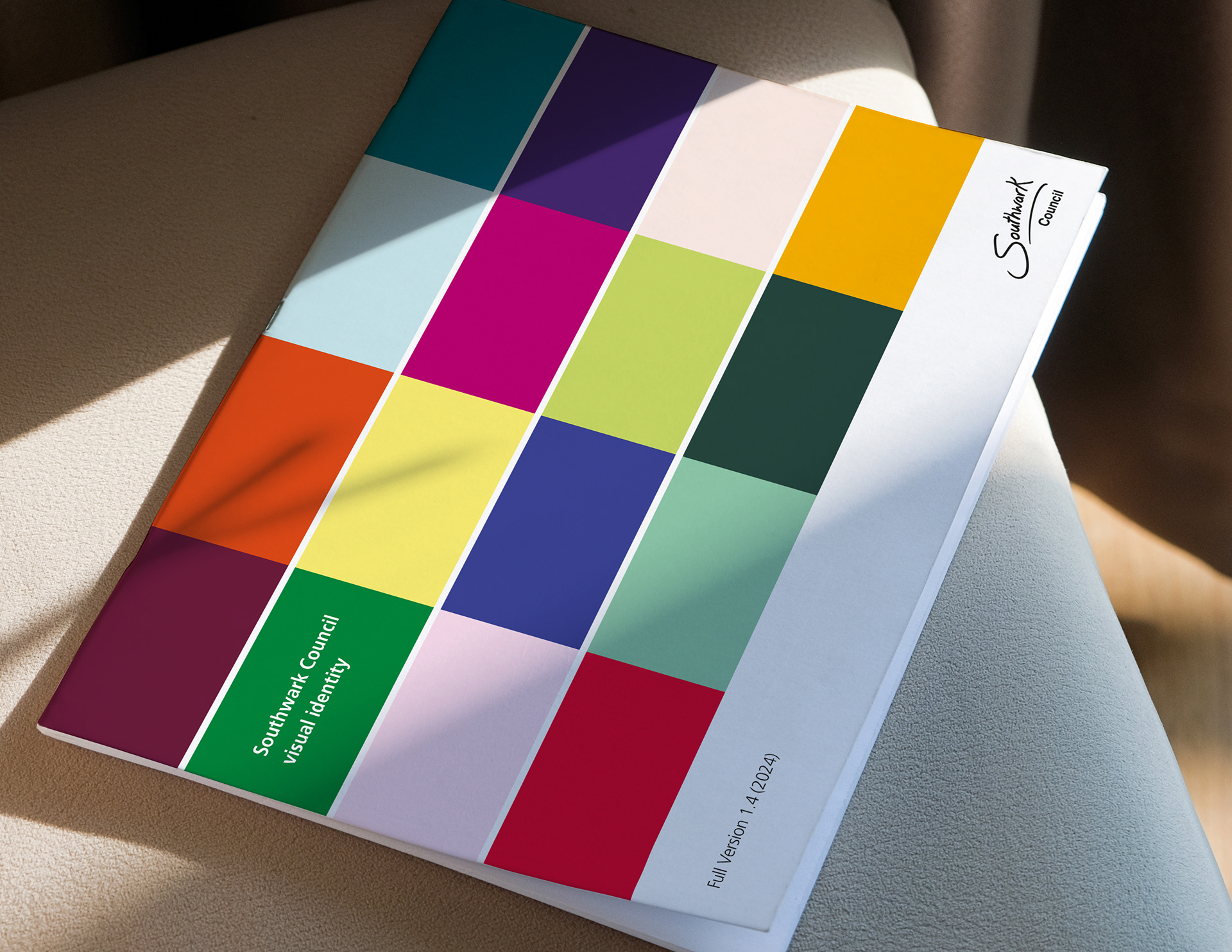
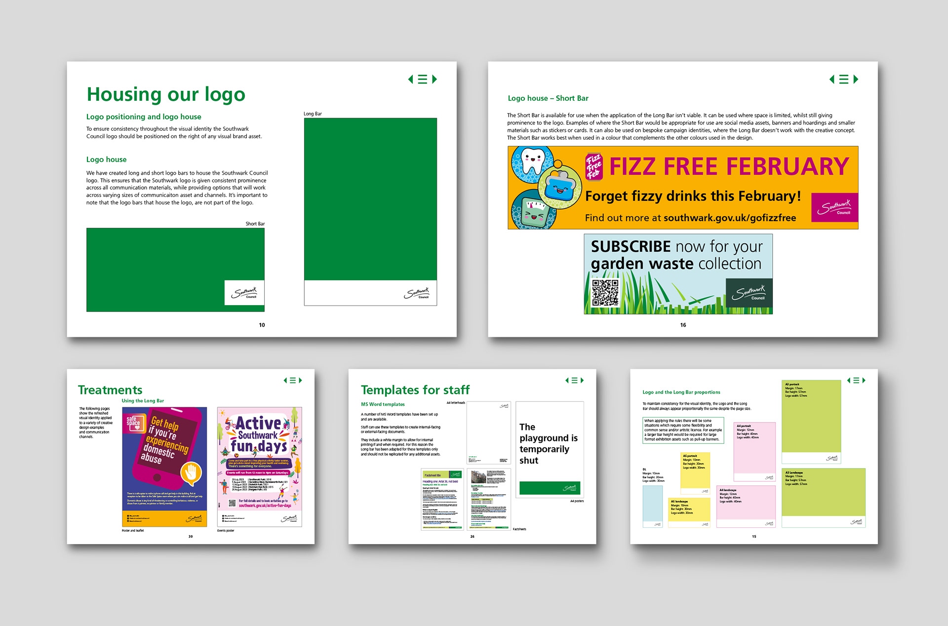
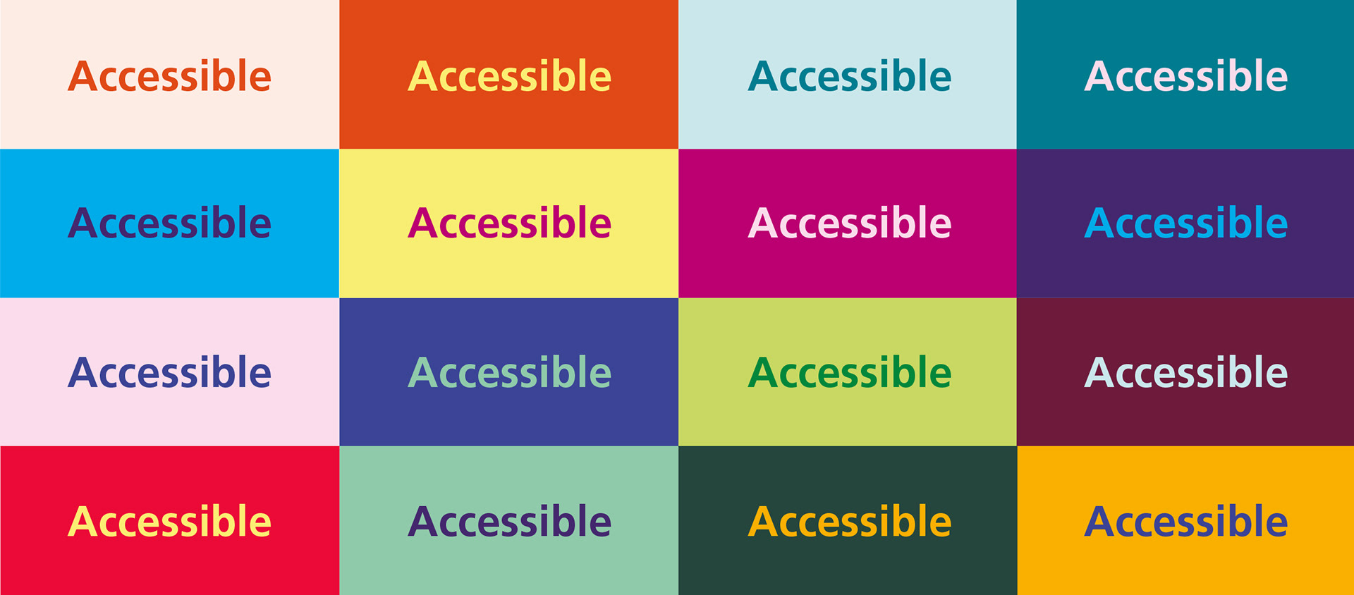
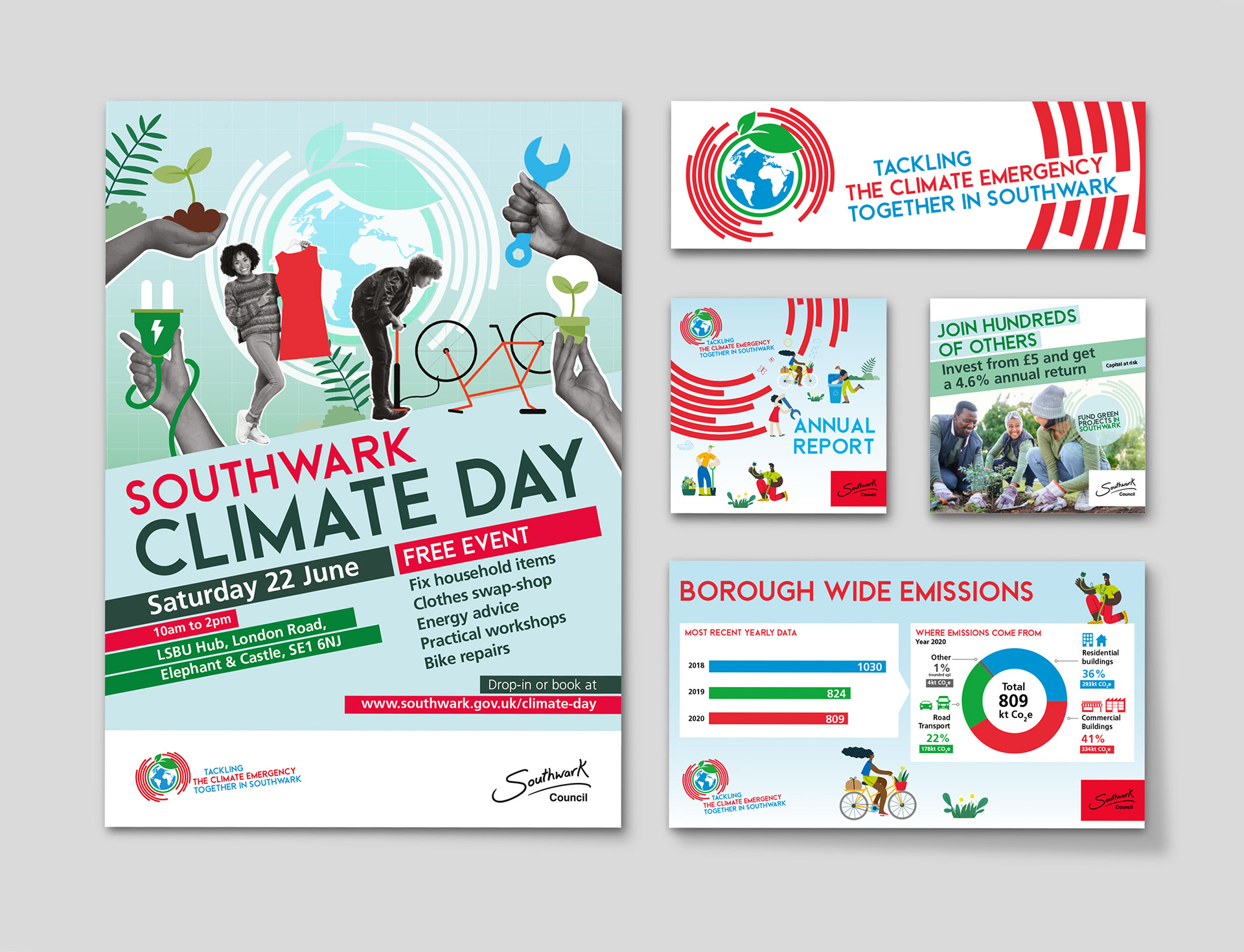
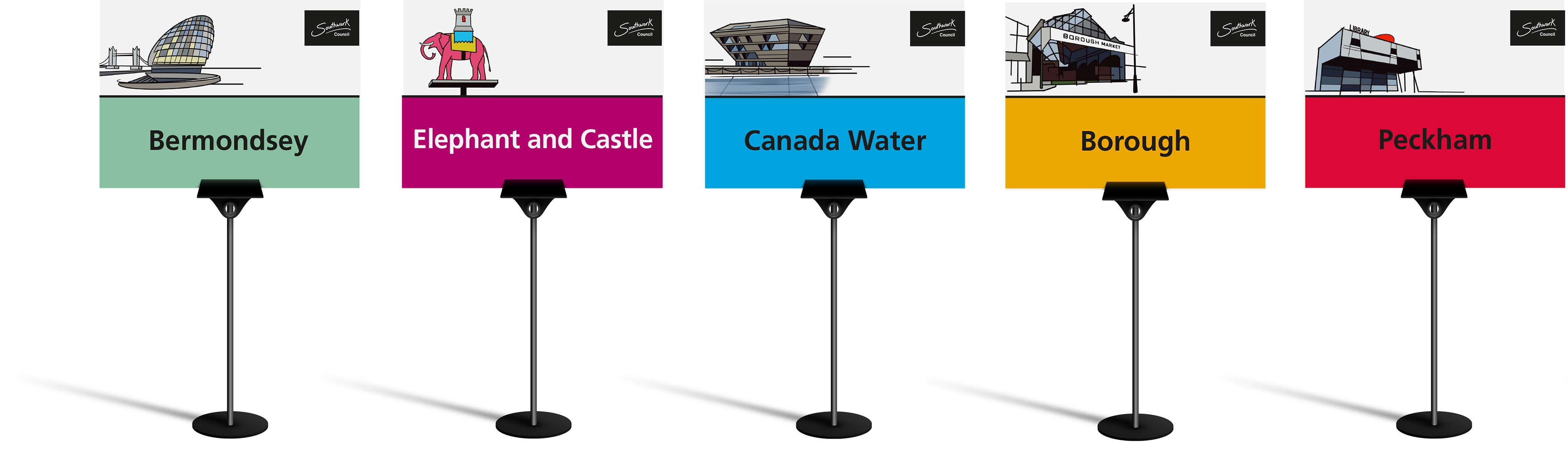
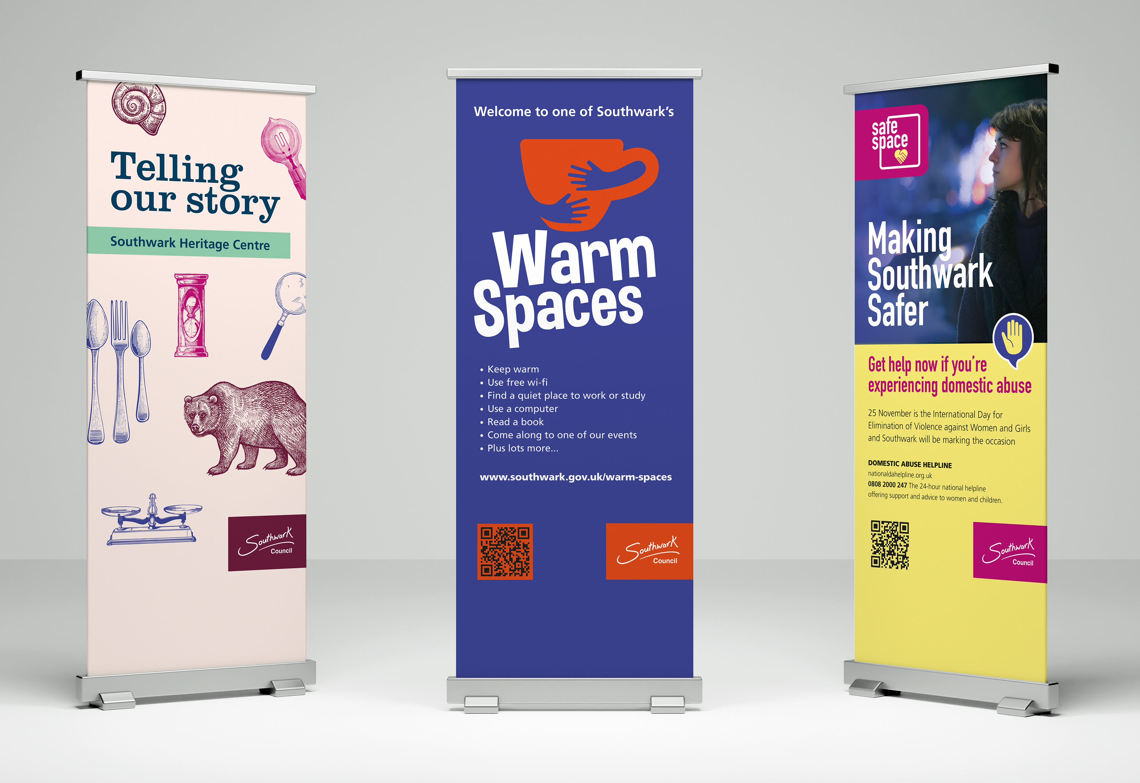
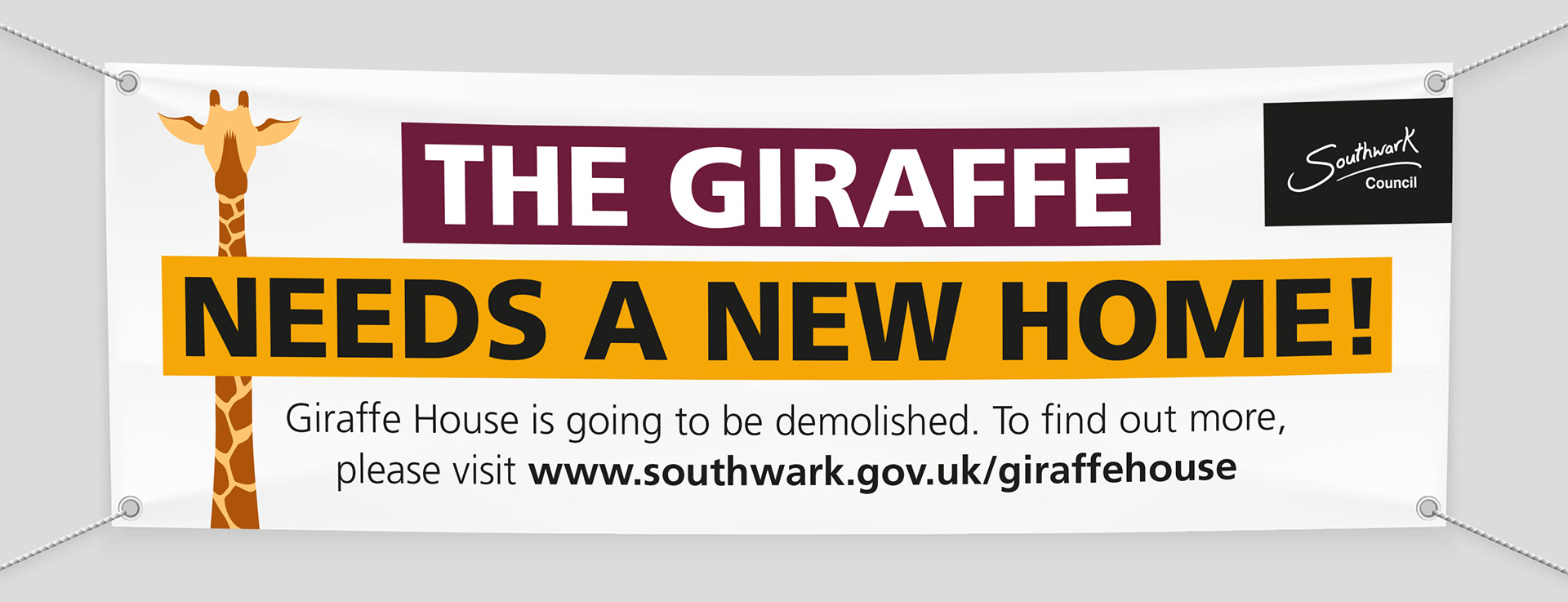
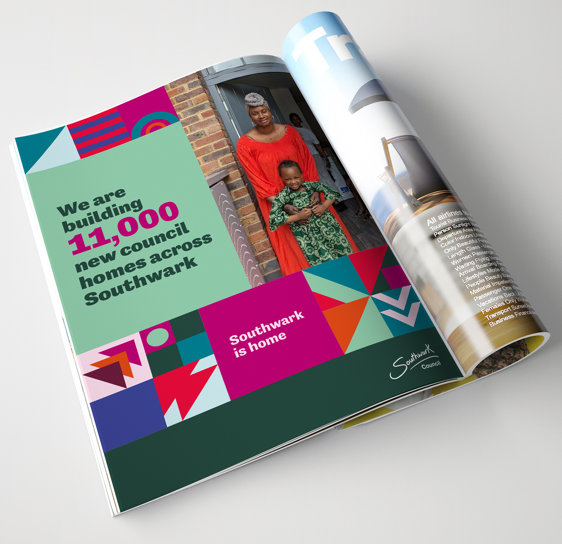
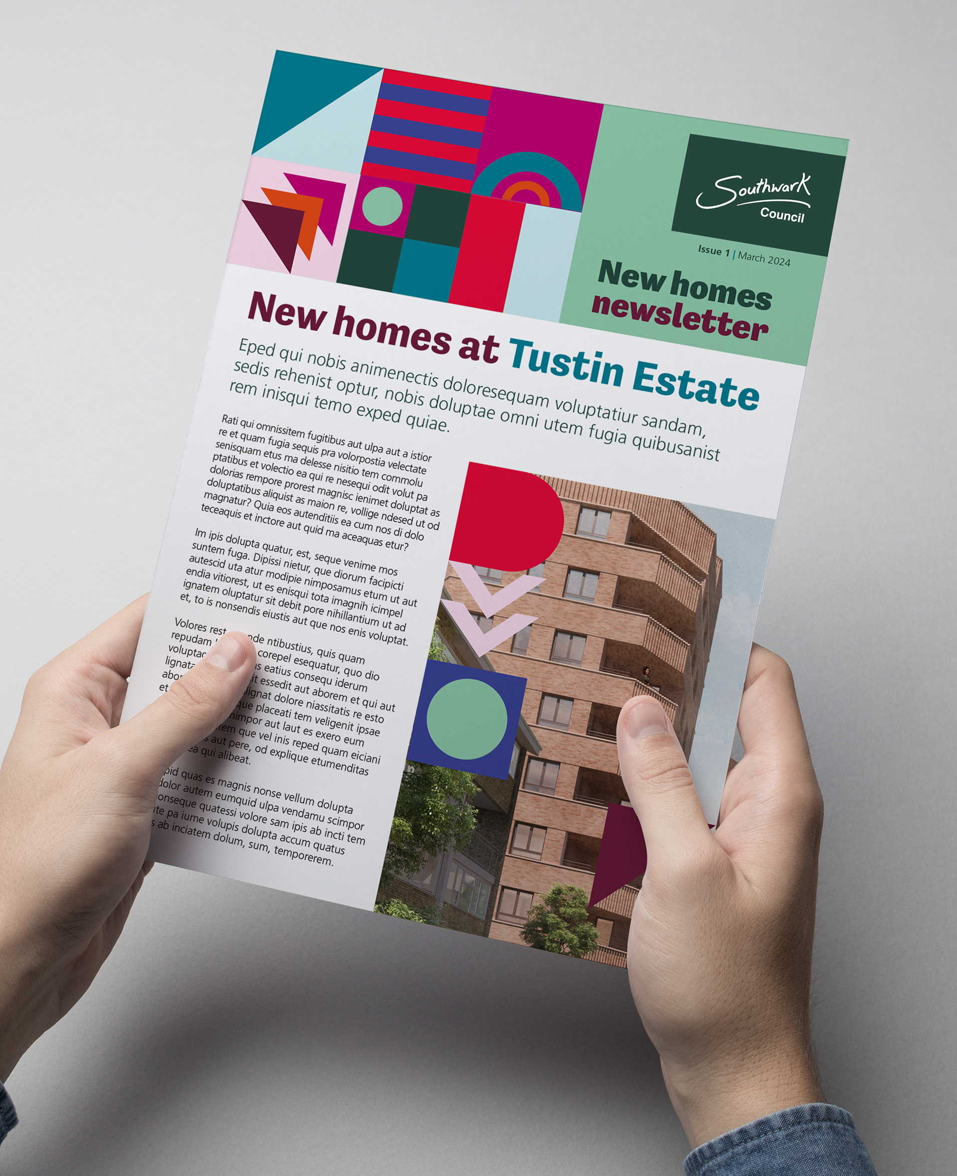
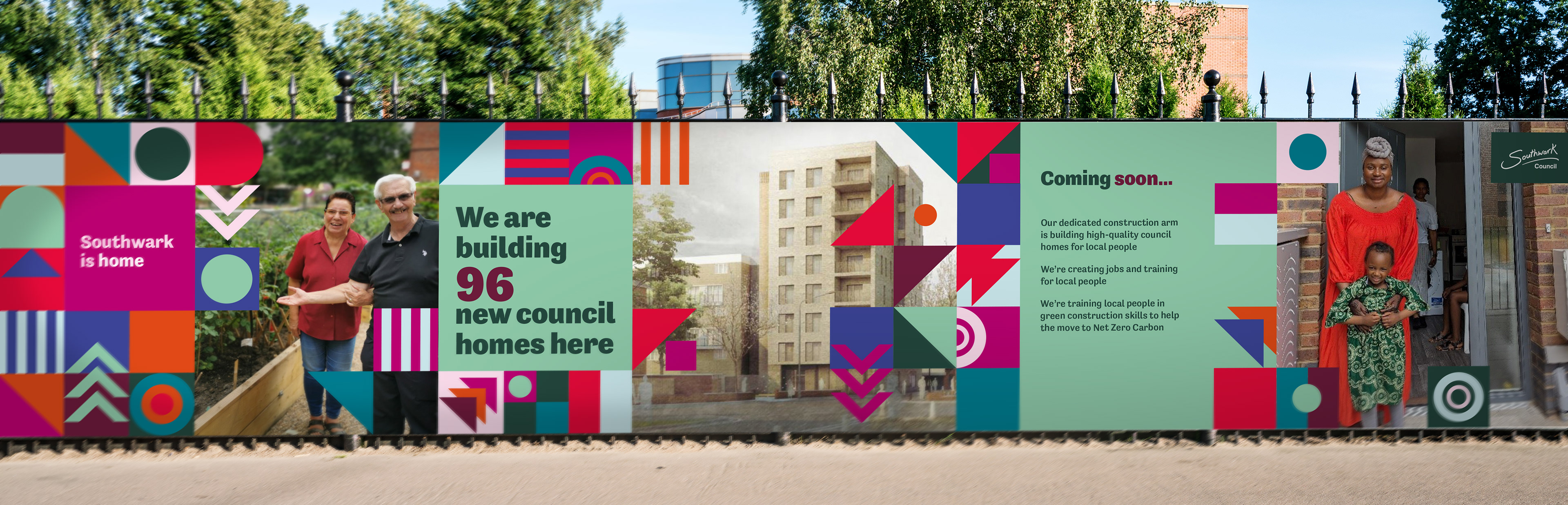
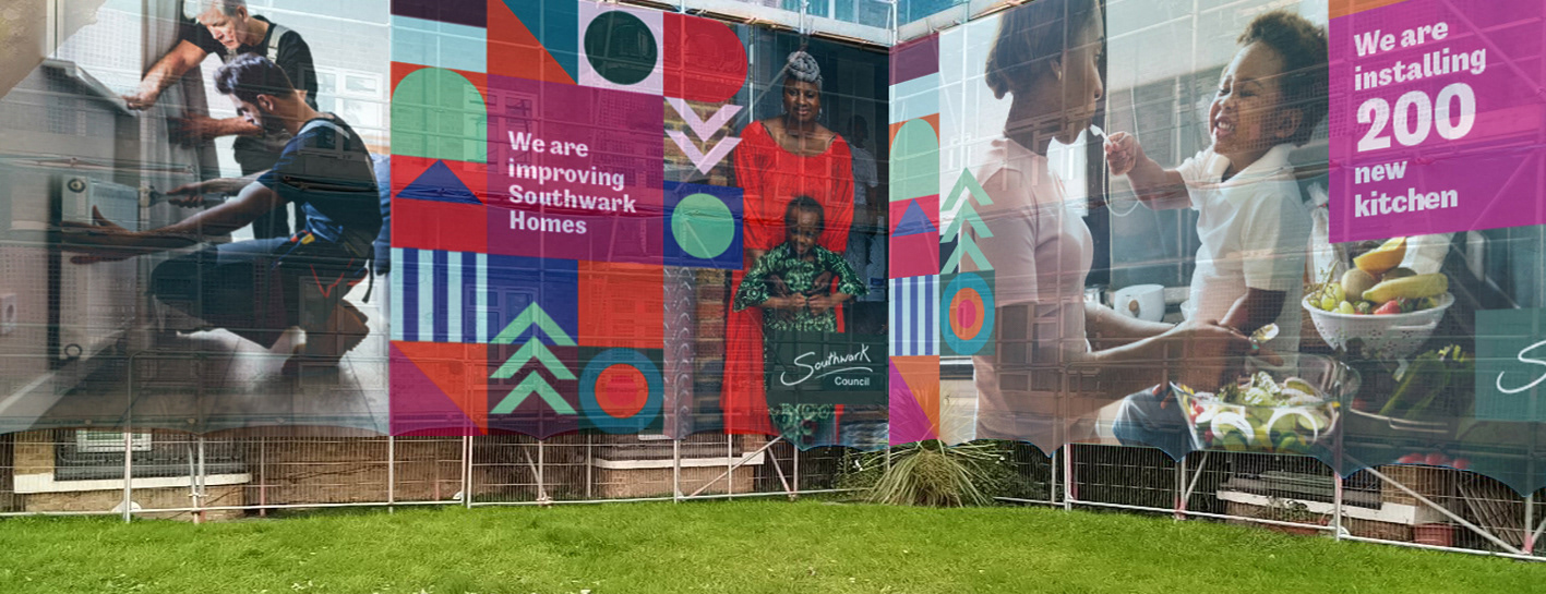
Southwark Council needed a refreshed visual identity that could be applied confidently by in-house teams across hundreds of materials, from posters and factsheets to digital templates. Working closely with the team, we built a practical, accessible system with clear logo architecture and an expanded colour palette designed to do the heavy lifting. Each hue has a defined role and tested contrast ranges, supported by a simple colour matrix that guides staff to WCAG AA-compliant pairings for both large and normal text. The result is a cohesive and inclusive identity that stays recognisable, keeps colour use consistent across print and digital, and makes everyday production faster and more reliable for busy teams.